Axion Research · welcome flow
Email graphics
Mobile first, built for the inside of the email. None of these carry the logo, the button or the research use line: those go in the email as live text so the first screen still works when images are blocked, and so the button is actually clickable and trackable.
← the static ad set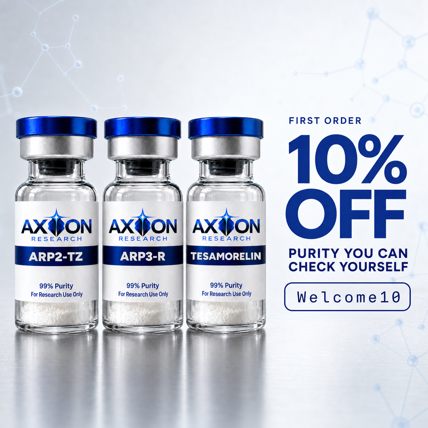
Welcome email 1, hero
Top of the first send, above the headline. Its whole job is to prove in half a second that this is a real brand with real product before anyone reads a word.
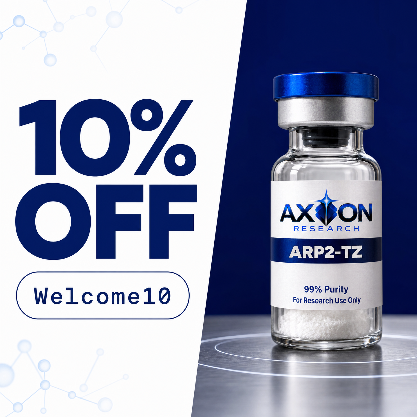
Welcome email 1, the offer
Carries the discount as designed type. The button underneath is real HTML so it is clickable and trackable, and the code is repeated as live text so it survives images being blocked.
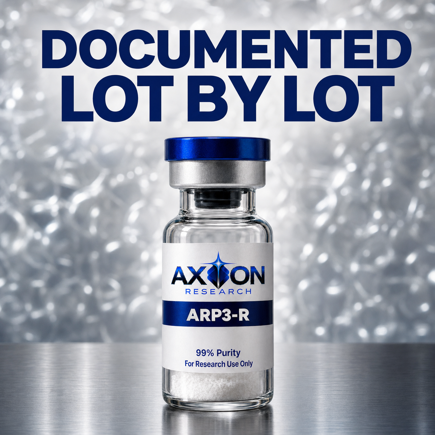
Welcome email 2, provenance
Answers the buyer's actual anxiety: where did this come from and did anyone check it. Built from Axion's own documentation story, not a generic lab shot.

Welcome email 2, the material
Shows the thing the brand claims instead of asserting it, so the reader draws the conclusion themselves. Carries no number, because a number has to be true of the specific SKU.
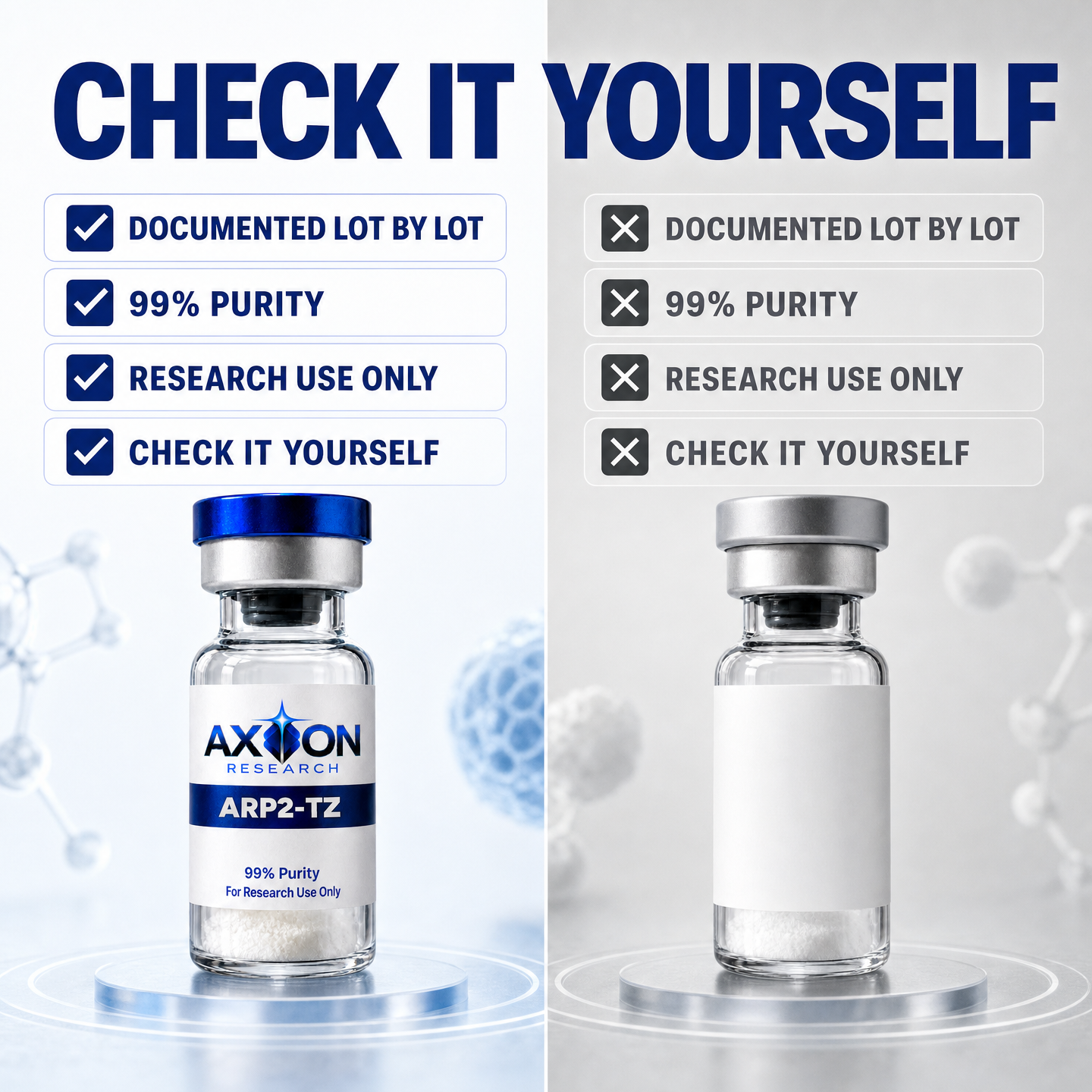
Welcome email 3, the comparison
A side by side that makes the alternative look like the mistake. Never names or depicts a real competitor.