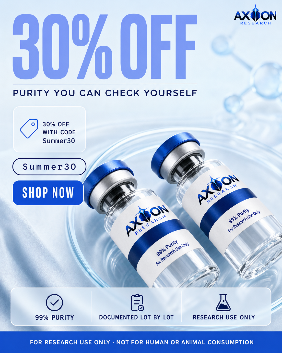
offer-based
Offer
The commercial terms are the whole message.
Vial on its side, discount at maximum scale, code pill.
art direction · clinical-glass
Axion Research · paid social statics
Every ad below is built from one locked vial shot, so the product is identical in all eight. What changes between them is not the background. It is the argument each one makes.
v2. The first pass used a wordmark reconstructed from Axion’s web artwork, and it was wrong: a single horizontal line with the star set off to the left. The real mark is a stacked lockup with the star standing in for the letter I. The master has been rebuilt directly from Axion’s own product photograph rather than from a description of it, and all eight ads re-rendered from that master.
All sizes, full resolution, sorted into folders by ratio. Includes the locked master vial and a plain-text sheet listing what is on each ad and what was deliberately kept out. Any single ad can also be opened at full resolution by clicking it.

The locked master
This shot is generated a single time and passed into every ad as a reference. That is why the cap, the crimp, the brand mark and the label are identical in all eight rather than being redrawn each time and drifting.
It is built from Axion’s own product photograph, not from a written description of the label. A logo described in words gets reconstructed by the model, and a reconstruction is an invention. Copying the real artwork is the only way the lockup comes out right.
The compound area is deliberately blank. No compound name, no dosage, no code. A label that names nothing makes no product claim, and one master then serves every compound instead of locking a separate vial per SKU.
Diversity here is an argument count, not a layout count. Four layouts of one argument is one ad. Each card names the argument it makes and how the vial is treated to make it.
offer-based
The commercial terms are the whole message.
Vial on its side, discount at maximum scale, code pill.
art direction · clinical-glass
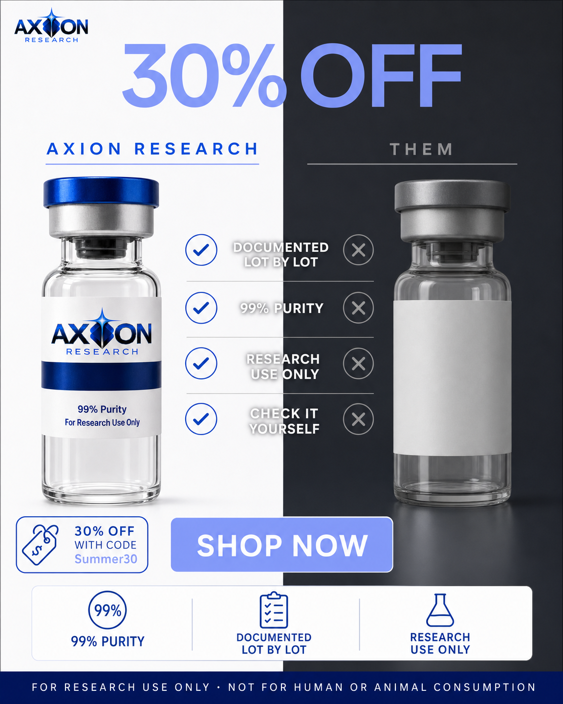
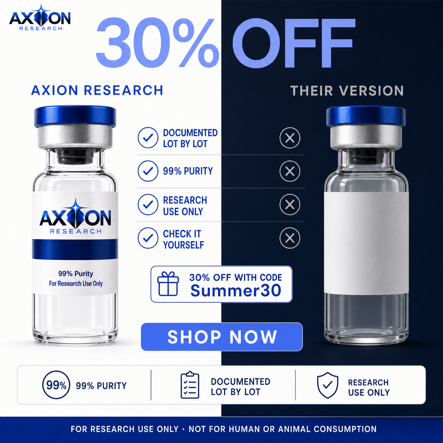
us-vs-them
A side by side that makes the other version look like the mistake.
Hard split, two identical vials, four paired claims. Never names a competitor.
art direction · editorial-white

crossed
Strike the word everyone expects and replace it with ours.
TRUST struck through, VERIFY beneath it in the brand accent.
art direction · aqua-macro

question-based
Ask what the buyer is already privately asking.
Vial cropped very large at a diagonal, bleeding off two edges.
art direction · aurora-alpine
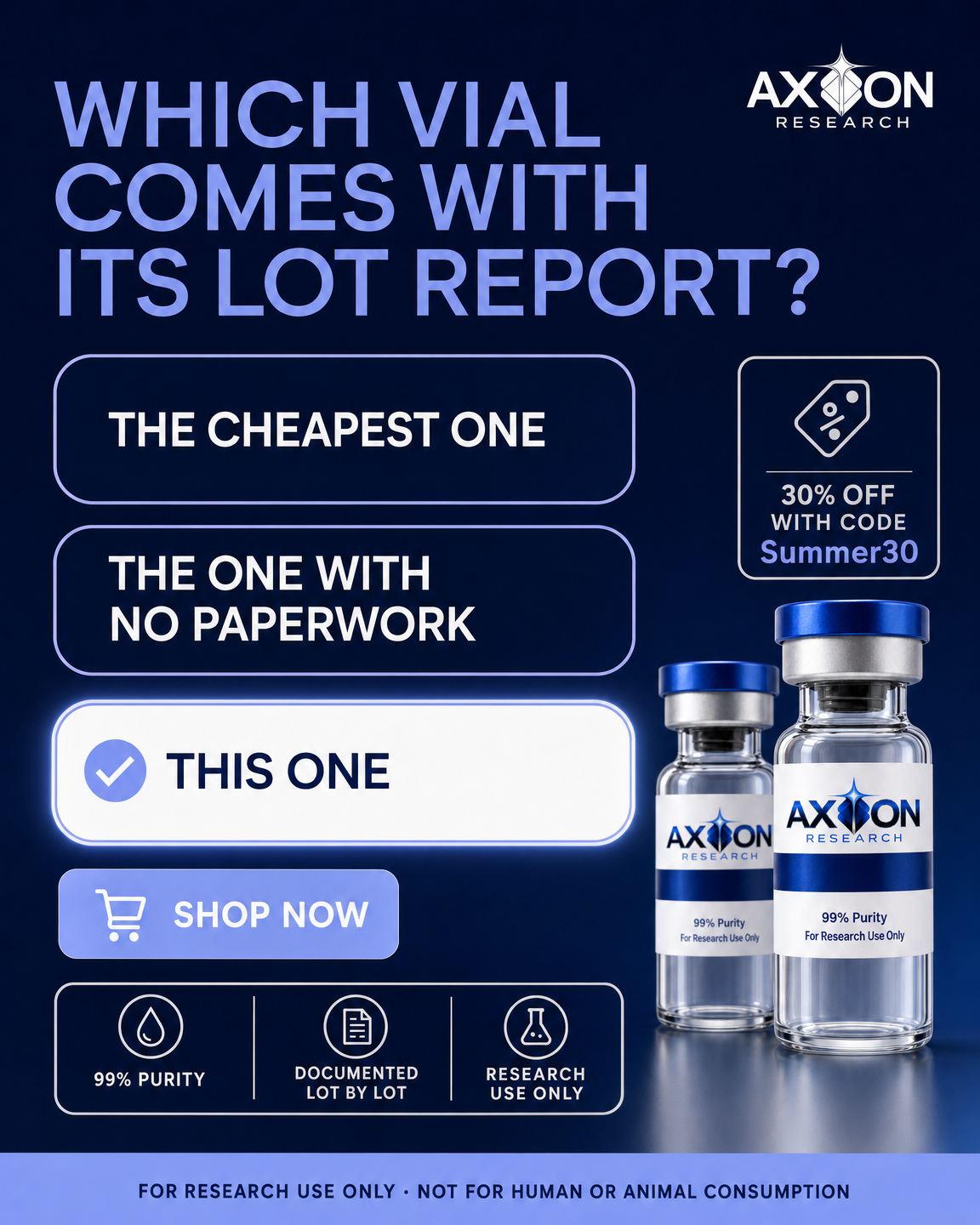
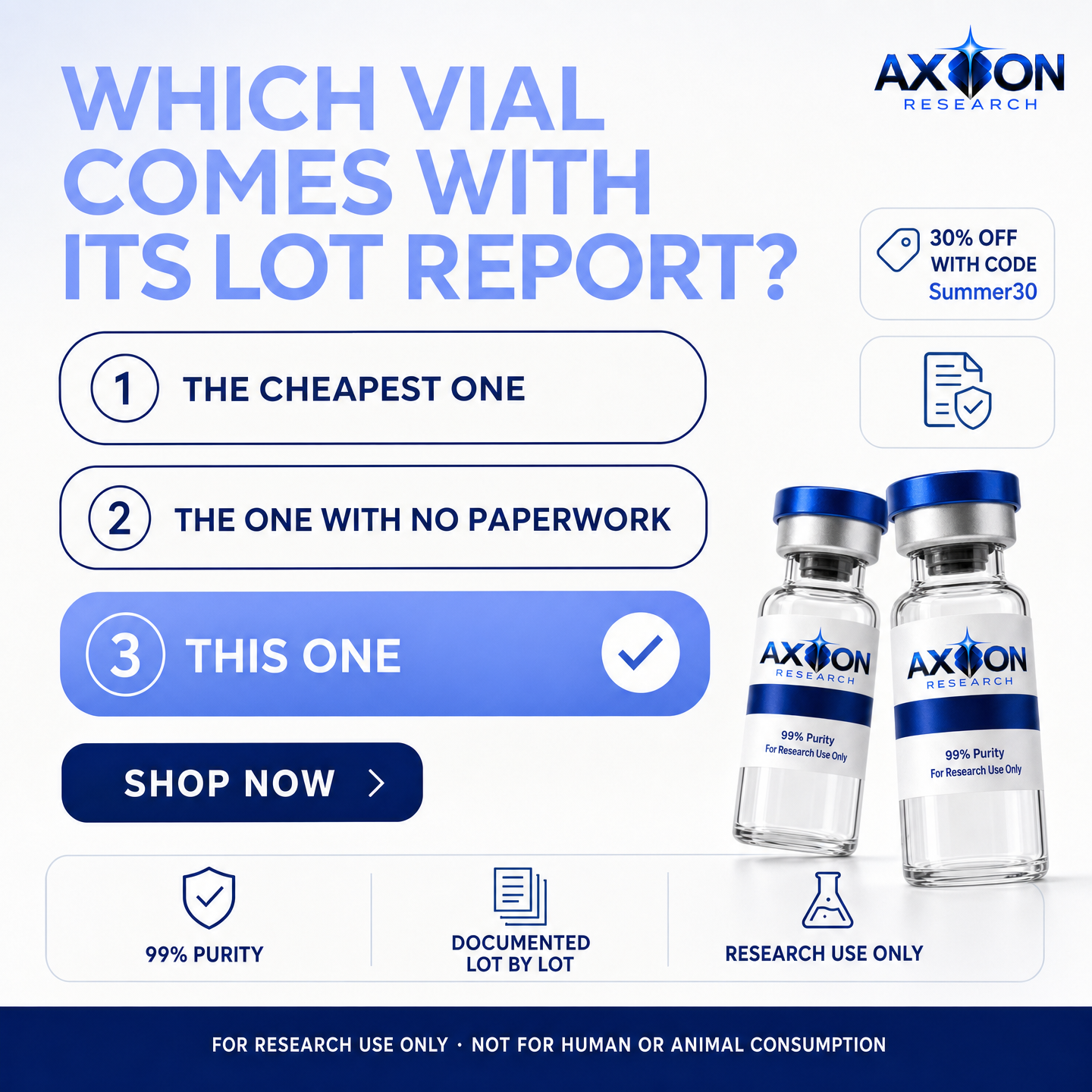
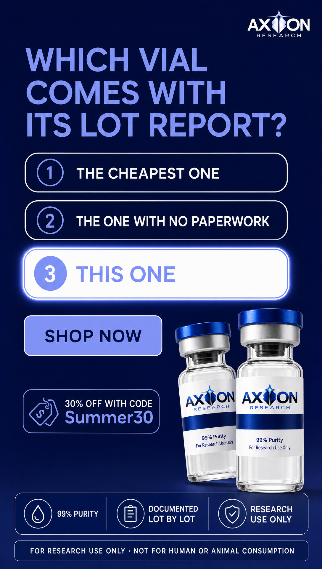
quiz
Make the viewer choose, and make the right answer ours.
Three answer pills, the last highlighted. Question is the hero, not the product.
art direction · editorial-white
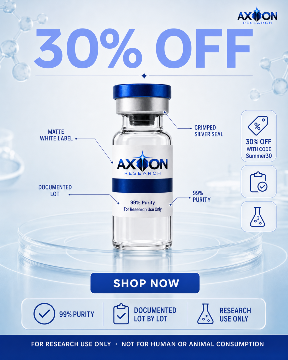
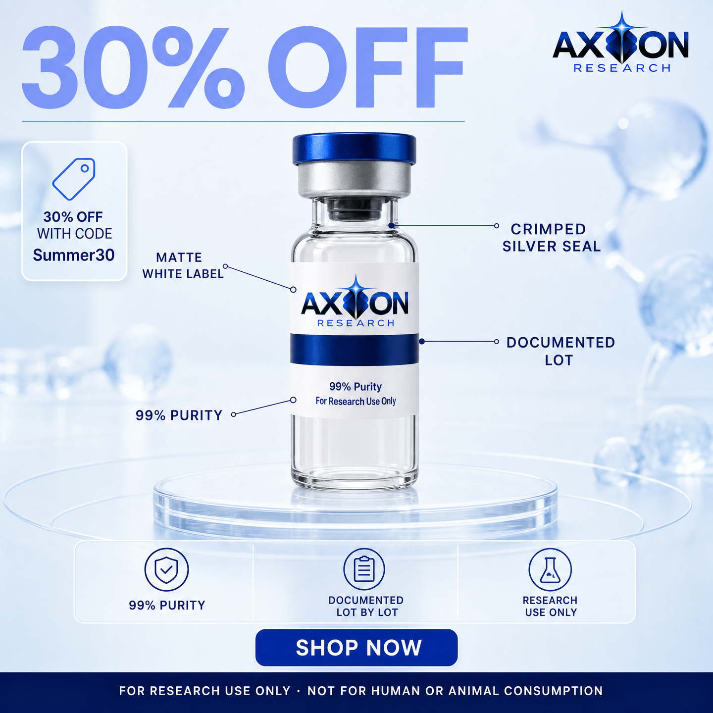
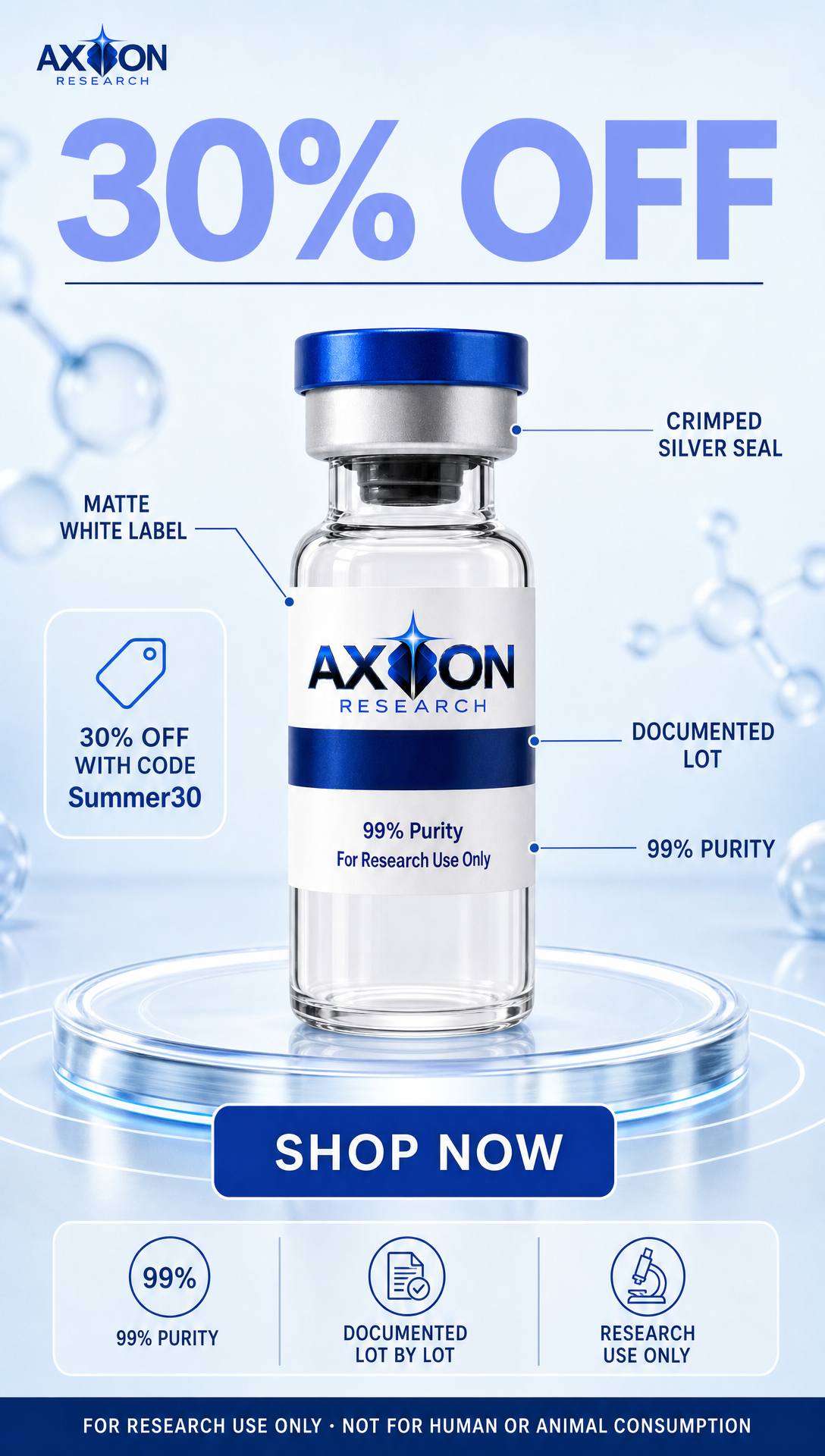
features
The product explains itself, part by part.
Four leader lines into the vial. The only centred layout in the set, because the lines need somewhere to point.
art direction · clinical-glass

news
Frame it as something that just broke, not something being sold.
Red chyron, circular product inset, lower-third CTA.
art direction · aqua-macro

negative
Open with the opposite of what a seller would say, then reverse it.
DO NOT BUY THIS VIAL, then the reversal underneath.
art direction · aurora-alpine
Not crops. Each one is generated for the shape, so the layout is rebuilt rather than squeezed.





Stories and Reels. Headline stacks taller, product drops into the lower half, and the call to action sits at thumb height. Width is a multiple of 32 because the generator requires it, which is why it is 1088 and not 1080.

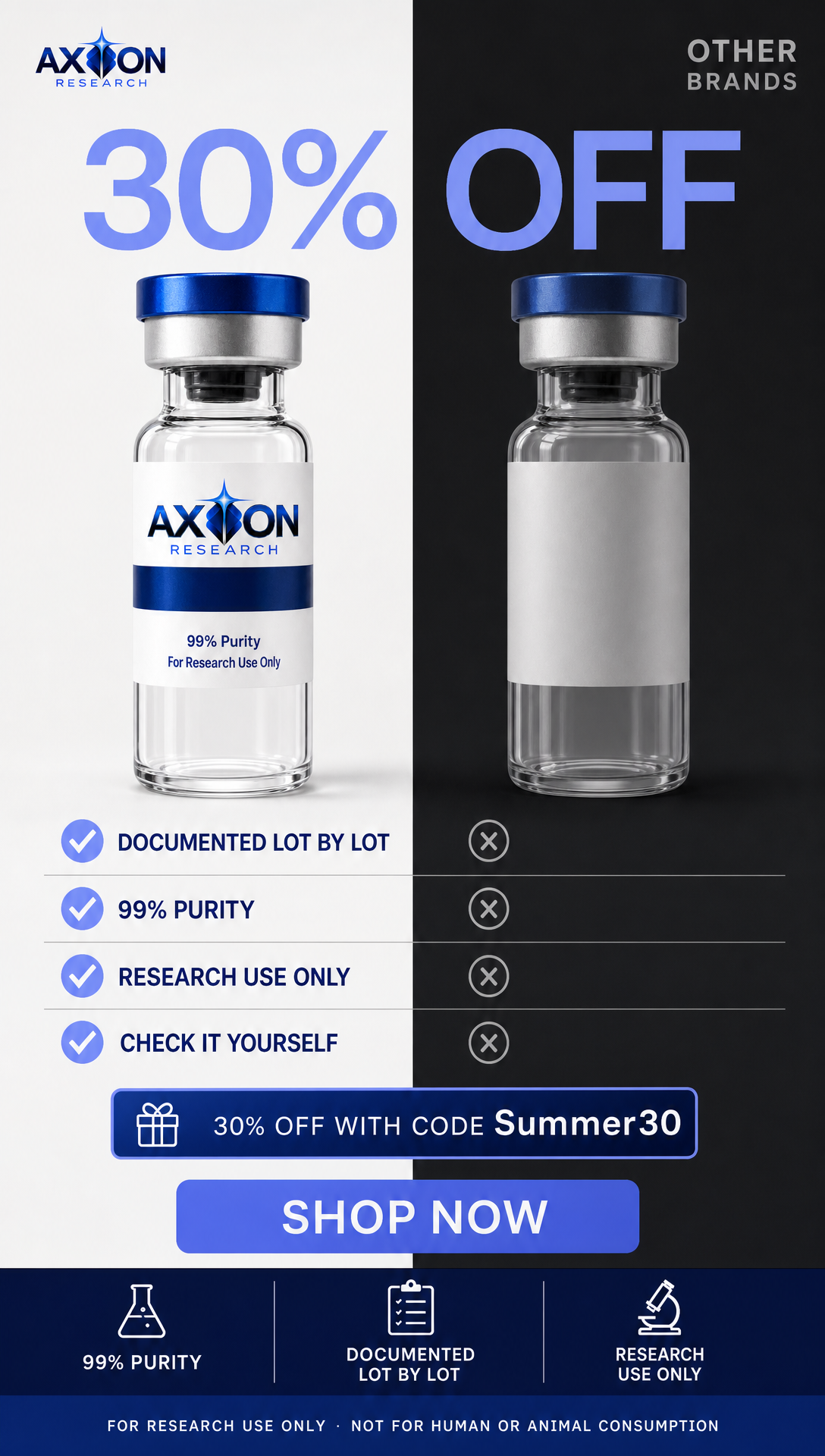




One art direction in the library was built around a hand holding a vial. That breaks the no-bodies rule for this category, and it would have passed every text check. It is now blocked at the source and cannot be picked for any client.